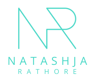
Sakshi

In the realm of non-profit organizations, where a multitude of initiatives coalesce under a single umbrella, the art of branding takes on a unique significance.
The crux of the challenge lay in preserving the unity of Sakshi while allowing its constituent programs and verticals to shine independently. This called for a delicate balance between consistency and individuality.
Designed to financially sustain the activities of the non-profit while fostering a brighter future, SBOX offers a range of services aimed at empowering individuals and institutions to become architects of the United Nations' 17 Sustainable Development Goals (SDGs).
SBOX's typography design is a testament to its essence. The outlines, reminiscent of a skeleton and framework, embody the foundational elements of existence. These intricate details symbolize the structural underpinning of sustainable change. The four corners framing the logo serve a dual purpose: they mirror the camera frame, encapsulating the essence of observation and documentation while representing the four pivotal spokes of SBOX's services—Systems, Strategy, Science, and Storytelling.
The very name, "SBOX," encapsulates the essence of this venture. It is akin to a box—a toolkit—filled with the tools and strategies needed to drive sustainability. Each service, each word crafted, is a key, unlocking the potential for a more sustainable world.

For each program, I meticulously crafted distinct names, logos and identities. These identities were not merely visual representations; they encapsulated the essence of each initiative. Through thoughtful colour palettes, typography choices, and symbolisms, the aim was to convey the unique mission, values, and aspirations of each program.

Brand
SBOX by Sakshi
Assets
Name
Brand Story
Logo
Stationery
Brandbook
Deck
Showreel
Brand
The Rakshin Project
Assets
Name
Brand Story
Logo
Stationery
Brandbook
Brand Film
Brochure
Teaching Material
Website
Deck
Social Media
Templates
Collective Action is a yearly conference designed by Sakshi that aims to serve as a dynamic platform for diverse stakeholders. Its primary mission: to champion the cause of Gender Equality.
The name ‘Collective Action’, reminds us all to forge networks and alliances, broaden support, and stand in solidarity. It encourages seeking help, extending a hand, fostering reflective dialogues, and inviting others to engage. These practices dismantle the isolation in which violence often thrives, fostering a sense of shared responsibility.
The Collective Action logo is a testament to its principles. Entwined within the typography, the 'O' in Action subtly incorporates elements that can also be seen as ‘CO’ for cooperate and collaborate, representing the very essence of Collective Action. The vibrant, colorful palette symbolizes diversity, equality, and inclusion, mirroring the rich tapestry of humanity. The logo's core motif visually portrays two individuals coming together in collaboration, emphasizing the power of unity in the pursuit of gender equality.
Collective Action is not just an event; it's a celebration of unity, a catalyst for change, and a symbol of our commitment to building a more just and equal society.

Brand
Collective Action
Assets
Name
Logo
Website
Invites
Stationery
Templates
The Rakshin Project (TRP) stands as a beacon of change in the fight against gender-based violence. In partnership with the Ministry of Youth Affairs, Government of India, this groundbreaking initiative aims to train an astounding 4 million NSS volunteers across 40,000 colleges in India. Their mission: to interrupt the cycle of gender-based violence at its roots.
Challenged with naming and branding this vital program, we faced a linguistic hurdle. While "Raksha" in Hindi signifies protection, TRP's true mission was prevention—instilling the concept of active bystander intervention. In response, we coined the term "Rakshin."
The TRP logo embodies its essence with two shades of blue. Blue, a color often associated with trust and responsibility, symbolizes the commitment of the volunteers to safeguarding their communities.
The logo is not just an emblem but a powerful message. It forms the alphabets T, R, and P, representing the project's name while ingeniously depicting an adult figure safeguarding a child—a vivid portrayal of TRP's dedication to nurturing a safer, more inclusive society.
The Rakshin Project (TRP) is not just a name and logo; it's a commitment to transforming lives and preventing violence, one empowered volunteer at a time.


Brand
Stage for Change
Teach for Outreach
Assets
Names
Logos
Posters
Social Media
Mechandise
In the dynamic landscape of Sakshi's initiatives, two distinctive brands emerge with a shared purpose—Stage for Change and Teach for Outreach. These initiatives are not just calls to actions with a 'donate-as-you-like' option that encourages participation, but also dual-missions that carry their individual purposes:
Stage for Change is a beacon of awareness, utilising the power of performance and theatre to shine a spotlight on pressing issues. Teach for Outreach, on the other hand, serves as a dynamic platform where experts conduct sessions and workshops, empowering individuals with creative expression.
Both Stage for Change and Teach for Outreach share a common name and visual identity. Their logos are minimalist, each carrying a symbol emblematic of their call to action. In Stage for Change, the spotlight symbolises the need to illuminate problems through awareness, while Teach for Outreach employs a highlighter pen, representing empowerment through knowledge, skills and tools.
The choice of neon yellow in both logos is intentional. Neon yellow, often associated with energy and enthusiasm, signifies the vibrancy and urgency of the causes they champion. The underlined words "Change" and "Outreach" in this vibrant shade accentuate their significance, urging action and engagement.